
OntarioColleges.ca is the centralized platform used by prospective students across Ontario to explore programs and apply to public colleges.
I led an end‑to‑end redesign of OntarioColleges.ca to make program discovery clearer, reduce exploration drop‑off, and improve conversion into Apply—while building a scalable foundation for content and future features.
The redesigned platform is now live and used by over 7 million people annually.
OntarioColleges.ca — Redesigning the Province’s Official College Exploration Experience
27.0% → 37.8% (+40% lift)
Overall conversion
(Visitor → Apply)
10.5% → 19.6% (+86.7% lift)
Programs funnel
(Programs → Apply)
37% → 32%
(-13.5% drop)
Bounce rate
63% → 68%(+7.9% lift)
Engagement rate
.png)


Snapshot
Role
Lead Product Designer
Timeline
6 Months (2025)
Platform
High-traffic public education platform (7M+ users annually)
Languages
Designed Bilingual interfaces supporting English and French experiences
Scope
Product Strategy, UX Research, Information Architecture, UX/UI Design, Interaction & Visual Design, Prototyping, Usability Testing, Design Systems, CMS Enablement
Users
Prospective students, career changers, returning alumni, guidance counsellors, parents, and international applicants
Problem
Students struggled to explore and evaluate programs due to fragmented navigation and structurally misaligned information architecture, resulting in high drop-off before application
Impact
-
Overall Apply conversion: 27.0% → 37.8% | +40% relative lift
-
Programs hub → Apply conversion: 10.5% → 19.6% | +86.7% relative lift (≈2×)
(This shows the redesign didn’t just add clicks—it materially improved decision confidence and forward progress from the highest‑intent surfaces.)
-
Bounce rate: 37% → 32% | −13.5% relative
-
Engagement rate: 63% → 68% | +7.9% relative
(Lower bounce + higher engagement indicates users are orienting faster and taking meaningful actions—consistent with the goal‑based IA and clearer navigation.)
-
Help Centre views: 11K+ since launch (EN/FR)
-
Channel shift: Chats ↑ ~60% daily, Phone calls ↓ ~30% daily
(Better in‑product clarity and self‑serve resolution reduce cost‑to‑serve while maintaining support access.)

Overview
OntarioColleges.ca is the primary discovery and application gateway for Ontario’s public college system. It serves first‑time applicants, returning learners, parents, guidance counsellors, newcomers, and international students—many making high‑stakes decisions with limited clarity.
The platform had strong traffic and trust, but struggled to turn exploration into confident action.

The Challenge
1 / User Problems
-
Overwhelming program pages with dense, inconsistent information
-
Confusion around availability, eligibility, intake timing, and competitive status
-
Difficulty exploring programs without a clear goal or program name
-
Filters and search that didn’t align with user expectations
-
Overuse and ambiguity of “Apply,” increasing anxiety early in the journey
-
Users didn’t struggle with how to apply — they struggled with figuring out what to apply to and whether they were making the right choice.
2 / Business & Platform Problems
-
High drop-off during program exploration
-
Reduced conversion from exploration to application
-
Lower engagement with discovery features
-
Increased reliance on external platforms

Research and Insights
A multi-method research program informed every major decision

UX Audit
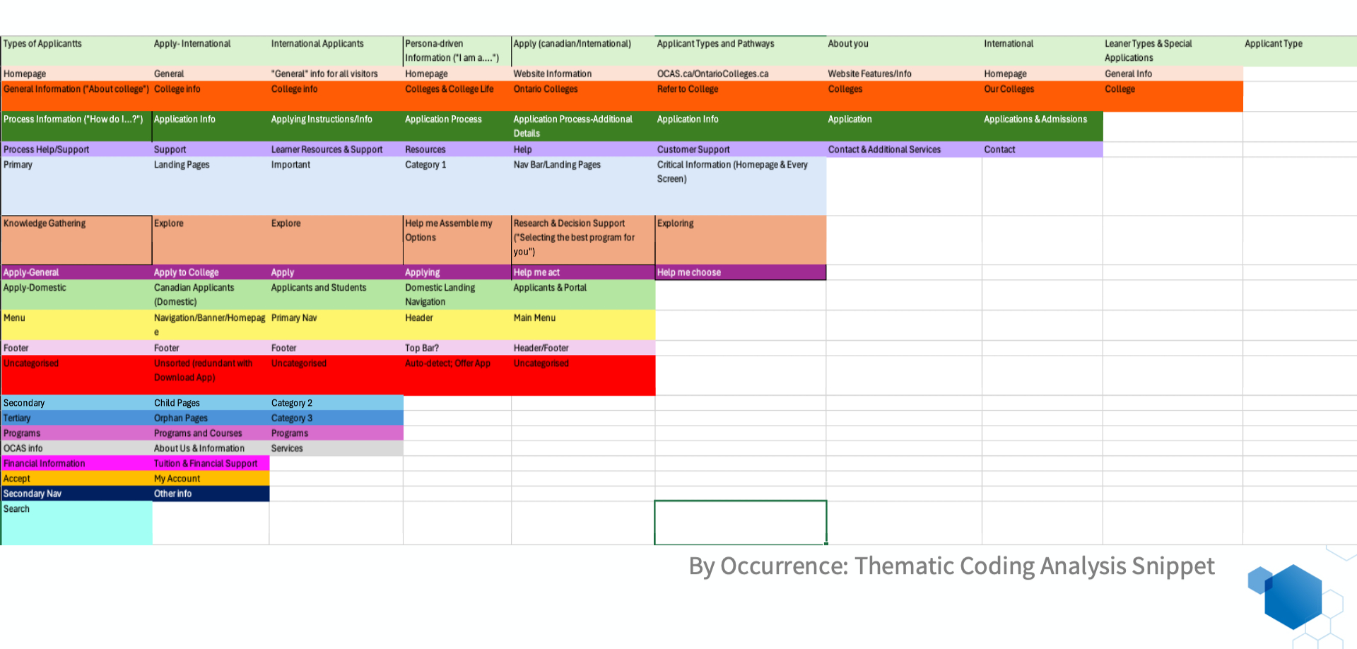
I led a comprehensive audit of the OntarioColleges website to evaluate content and information architecture.
Key insights
-
Redundant and repetitive content
-
Underutilized or confusing sections
-
Inconsistent labeling across navigation and pages
-
Gaps in critical decision-support information
Implication
Navigation and content structure needed simplification and consolidation while preserving essential information.

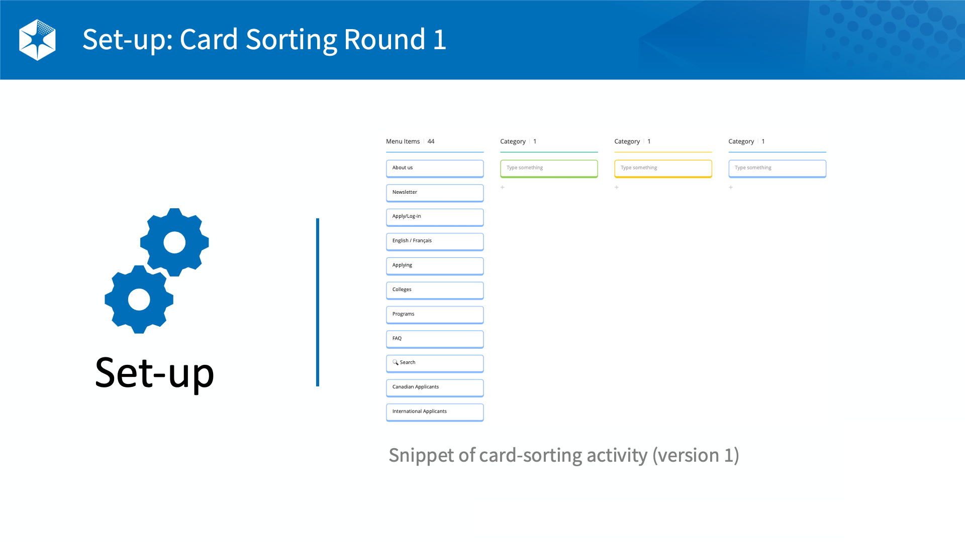
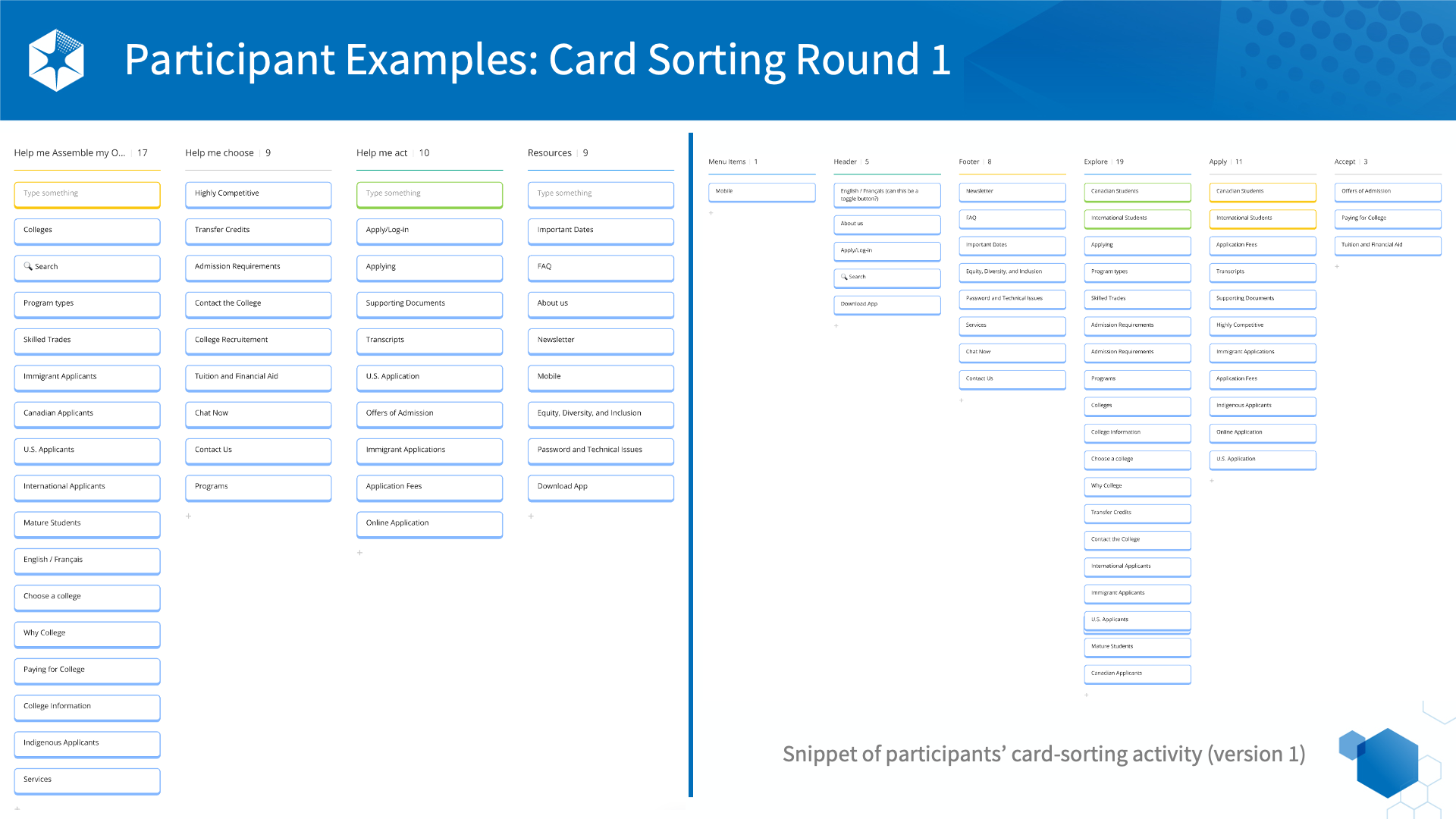
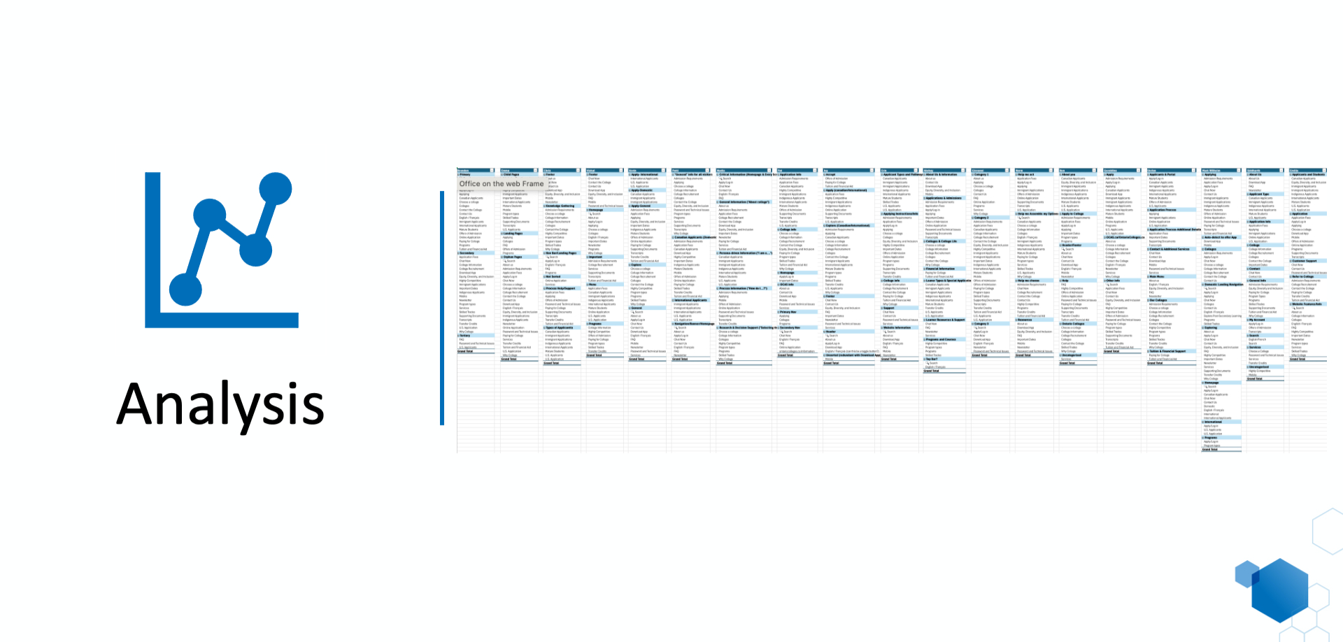
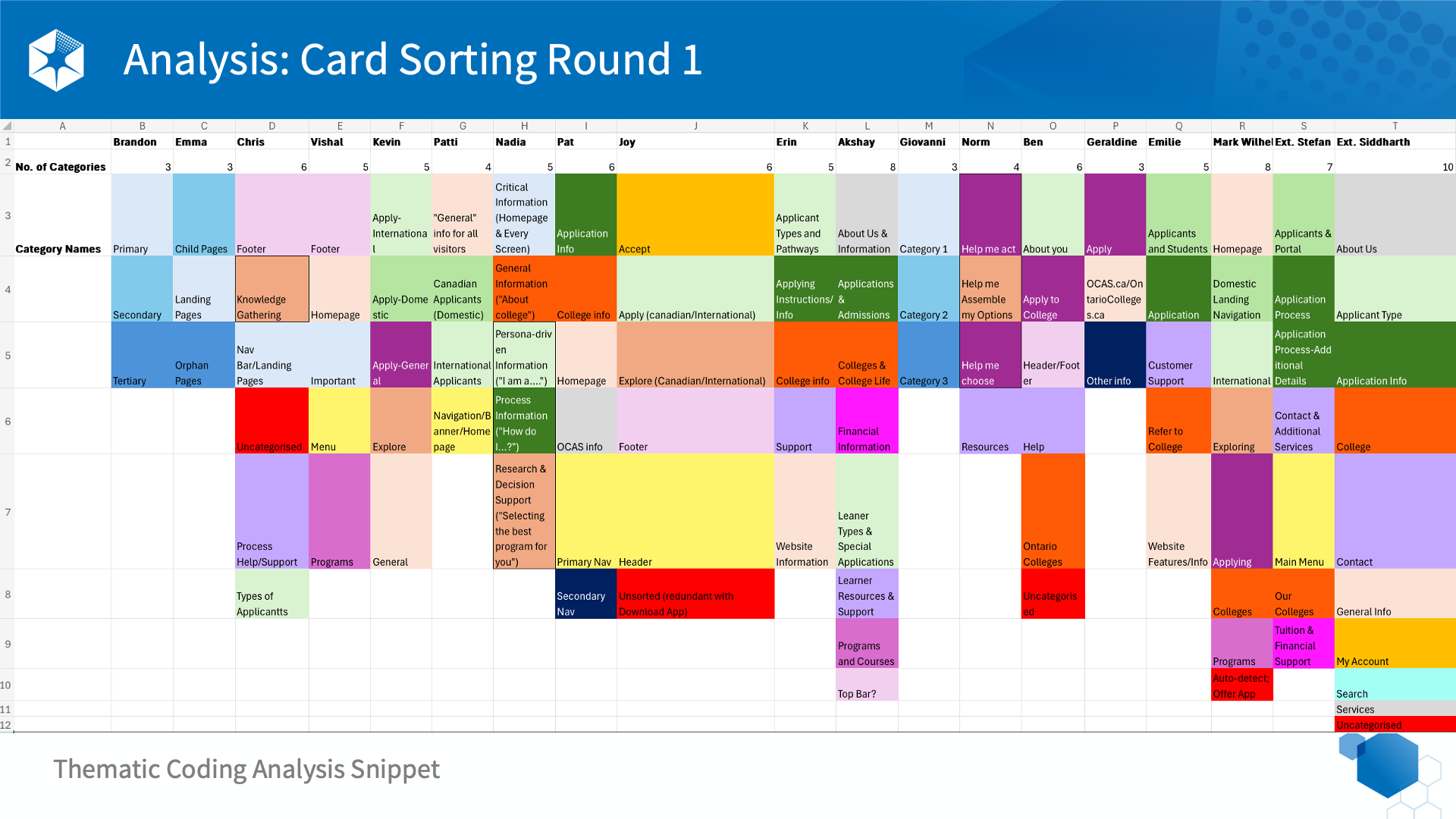
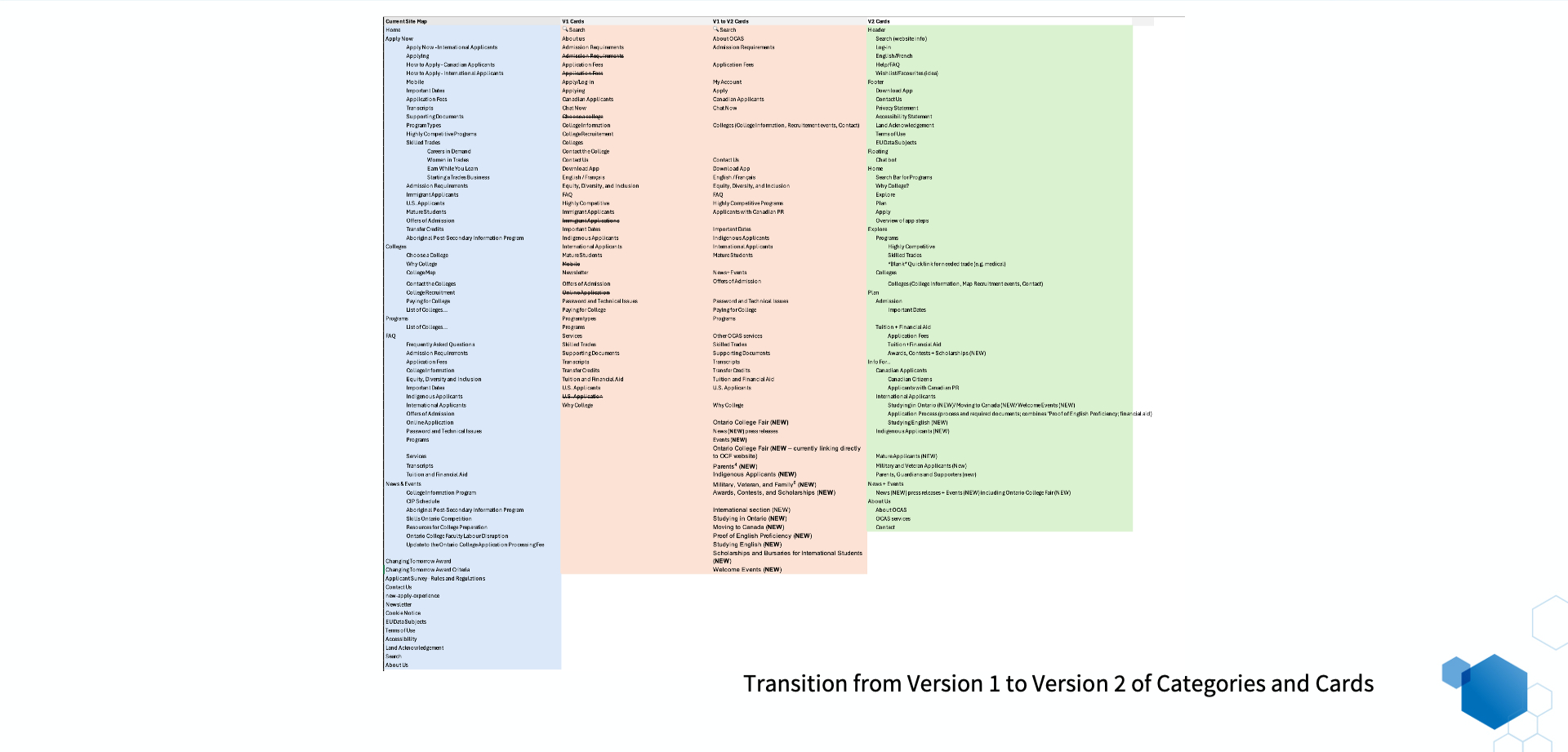
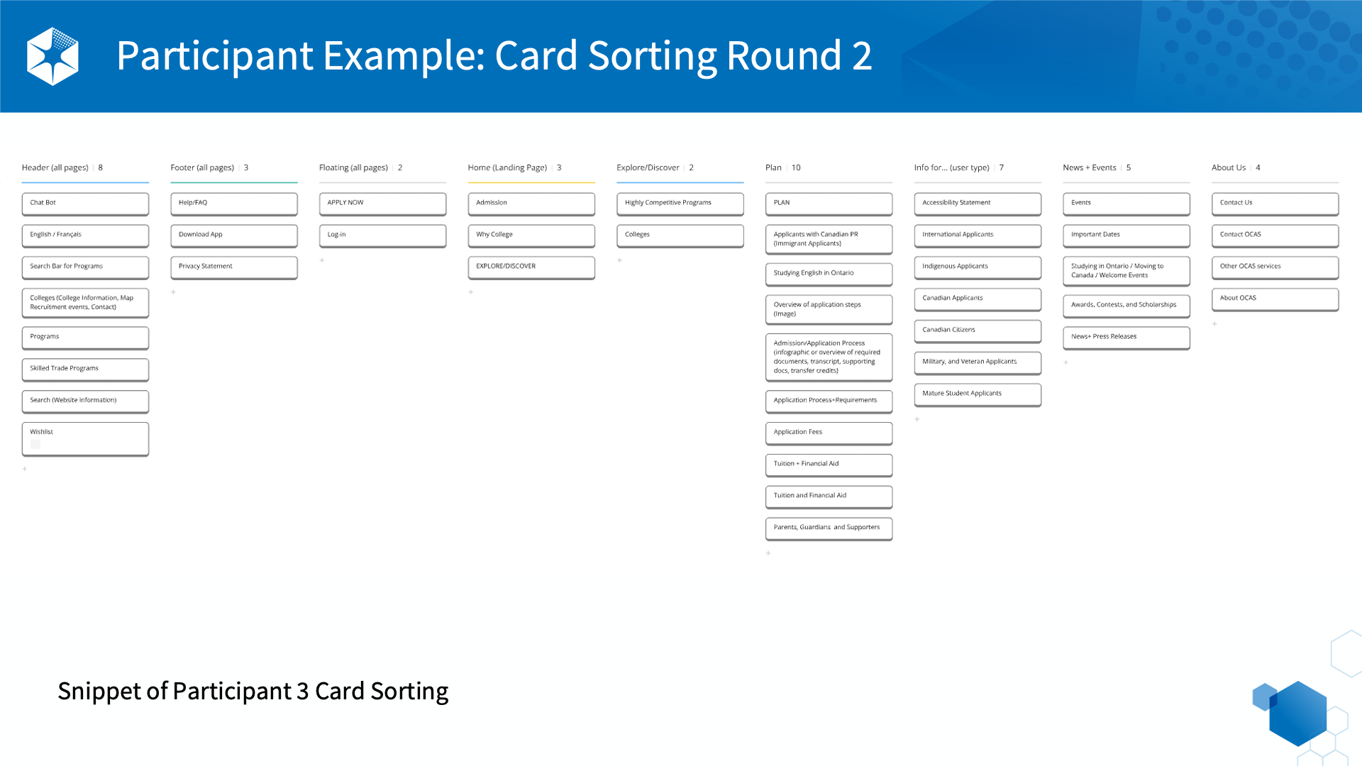
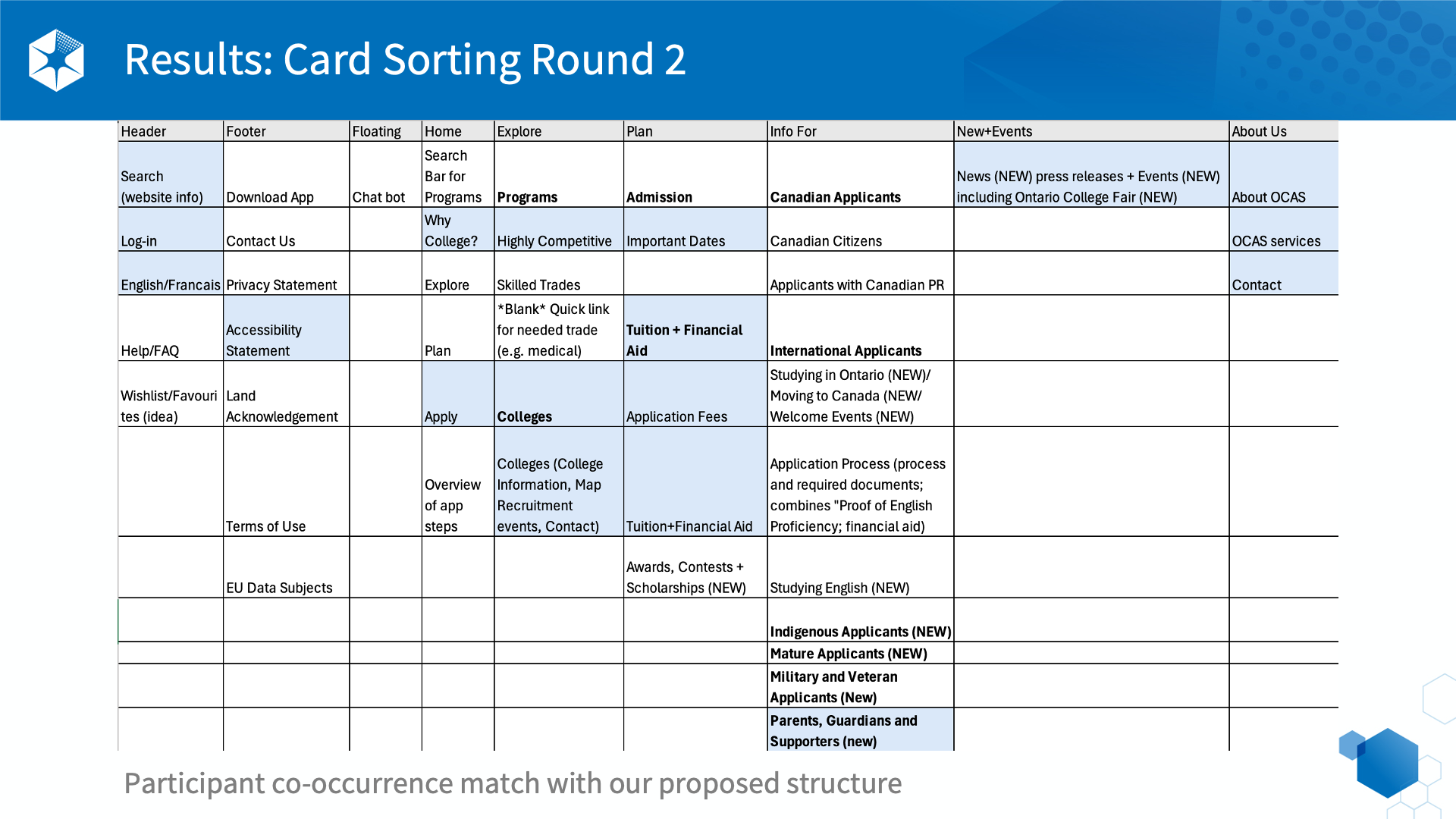
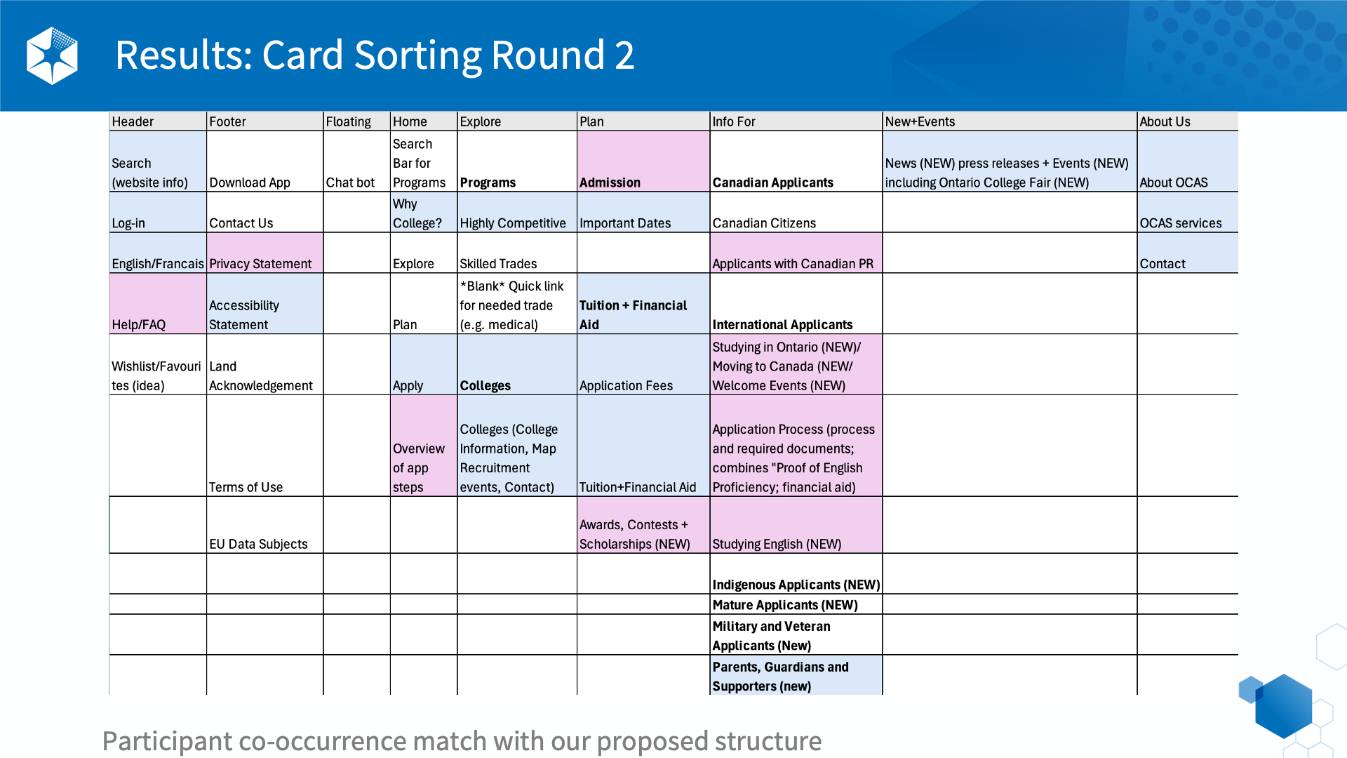
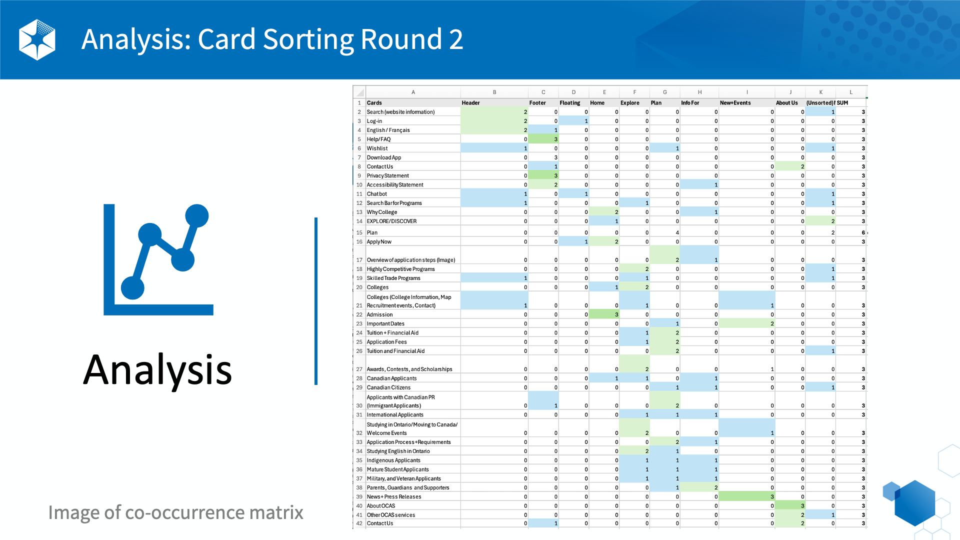
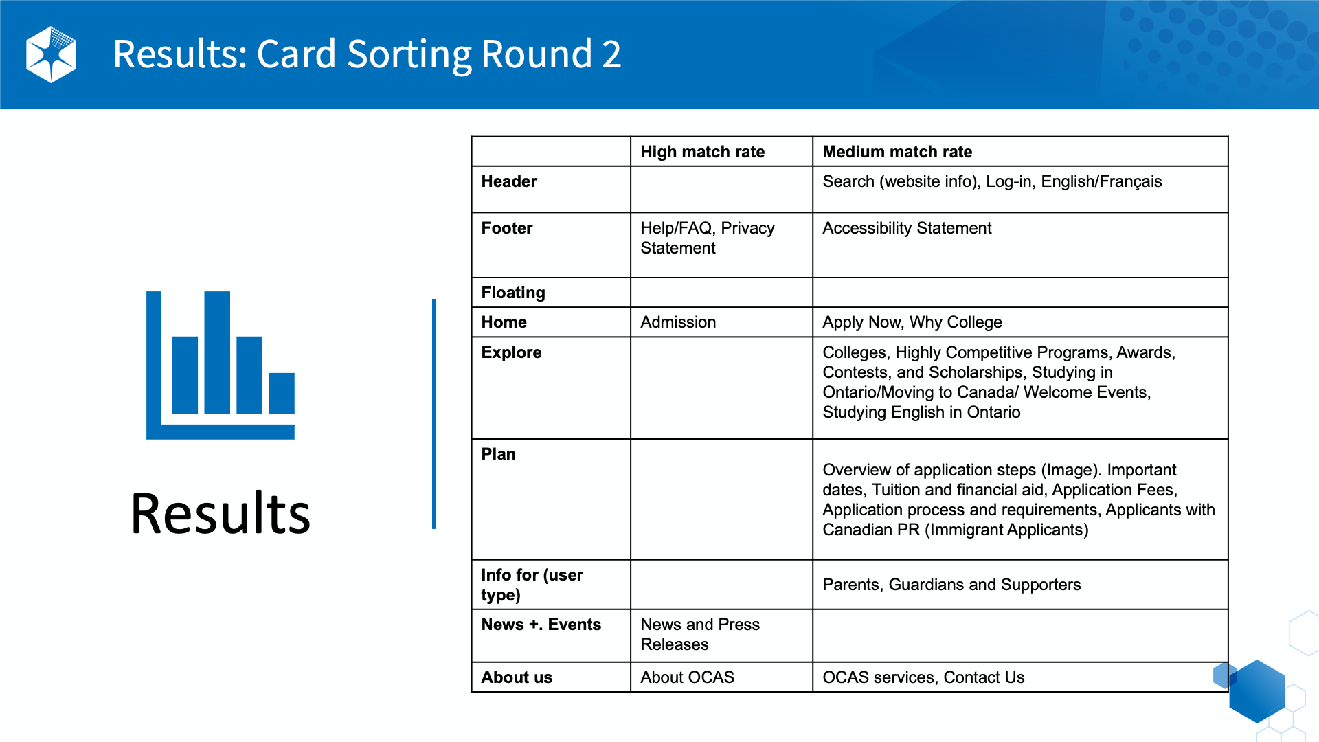
Card Sorting
I conducted two rounds of card sorting to understand how users organize information.
Key insight
Users organize information around goals and tasks, not institutional categories.
Implication
The information architecture needed to shift toward a task-based navigation model.

User Interviews
I conducted interviews with prospective students, indirect applicants, and parents/supporters.
Key insights
-
Location was the primary decision driver
-
Users revisited the site multiple times during research
-
Program information was difficult to scan and compare
-
Users preferred clarity over content volume
-
Highly competitive programs needed earlier visibility
Implication
Program discovery needed to be clearer, faster to scan, and easier to compare.

Analogous Product Analysis
I analyzed comparable platforms and industry leaders to identify effective patterns.
Key insights
-
Clear navigation supports complex decision journeys
-
Simplified menus reduce cognitive load
-
Consistent labeling improves clarity and trust
Implication
These patterns informed improvements to navigation and content structure.

Analytics (GA4)
I analyzed search and behavioral data to understand how users explore programs.
Key insights
Users primarily searched by field of interest rather than specific program names.
Top filters:
-
Program Category
-
Highly Competitive Programs
-
Campus
-
Program Level
Implication
The experience needed to support interest-based exploration and filtering.

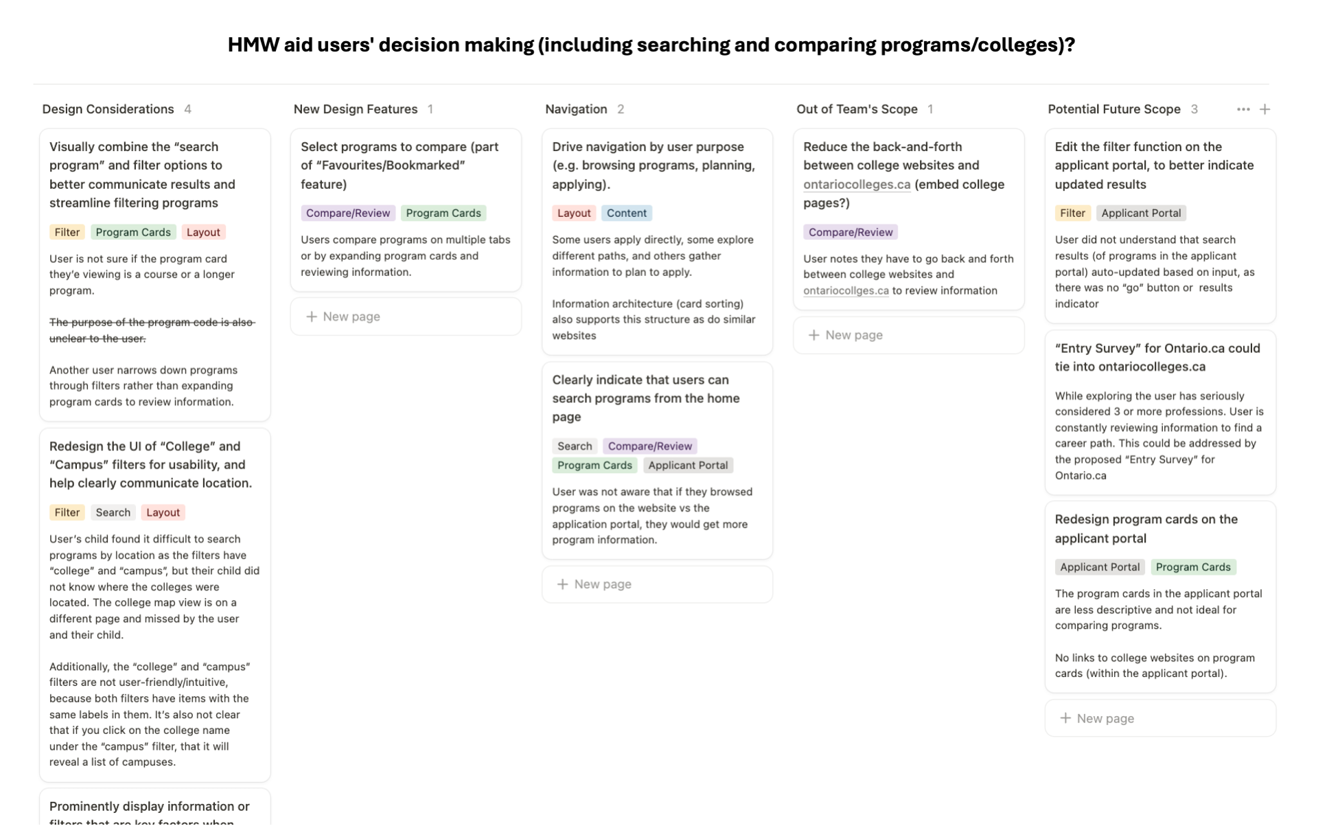
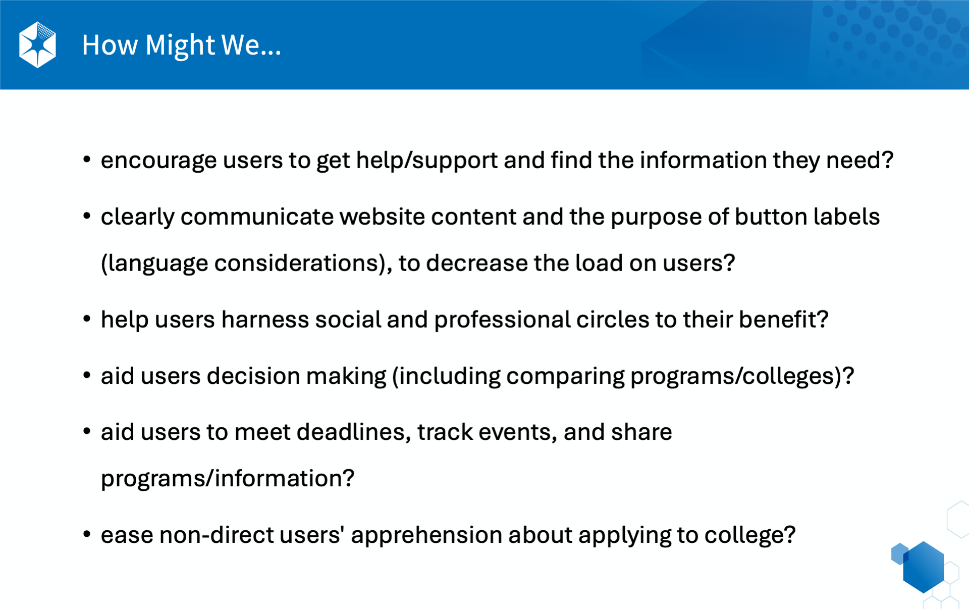
How Might We's
I facilitated synthesis workshops using How Might We statements.
Outcome
Research insights were translated into product opportunities across:
-
Navigation
-
Search and filtering
-
Program pages
-
Content structure
Implication
This aligned stakeholders and guided the product direction.
Core Insight
Education decisions are emotional and high‑stakes. The experience needed to actively build clarity, reassurance, and confidence — not just improve usability.

Personas
The Straight Shot
Based on Research and Insights I created four archetypes
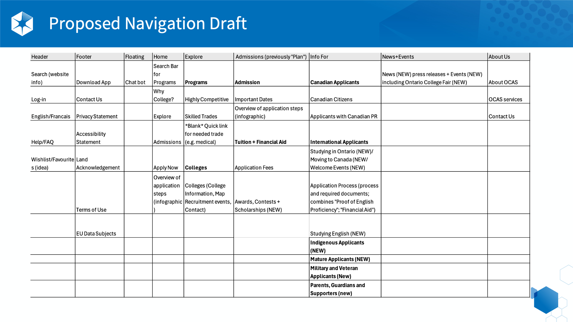
Information Architecture and Navigation Redesign
1 / Before
Categories reflecting internal structures rather than user intent
Deep, inconsistent navigation paths
High cognitive load, especially for first-time and exploratory users
Overcrowded menus with repetitive and unclear labels
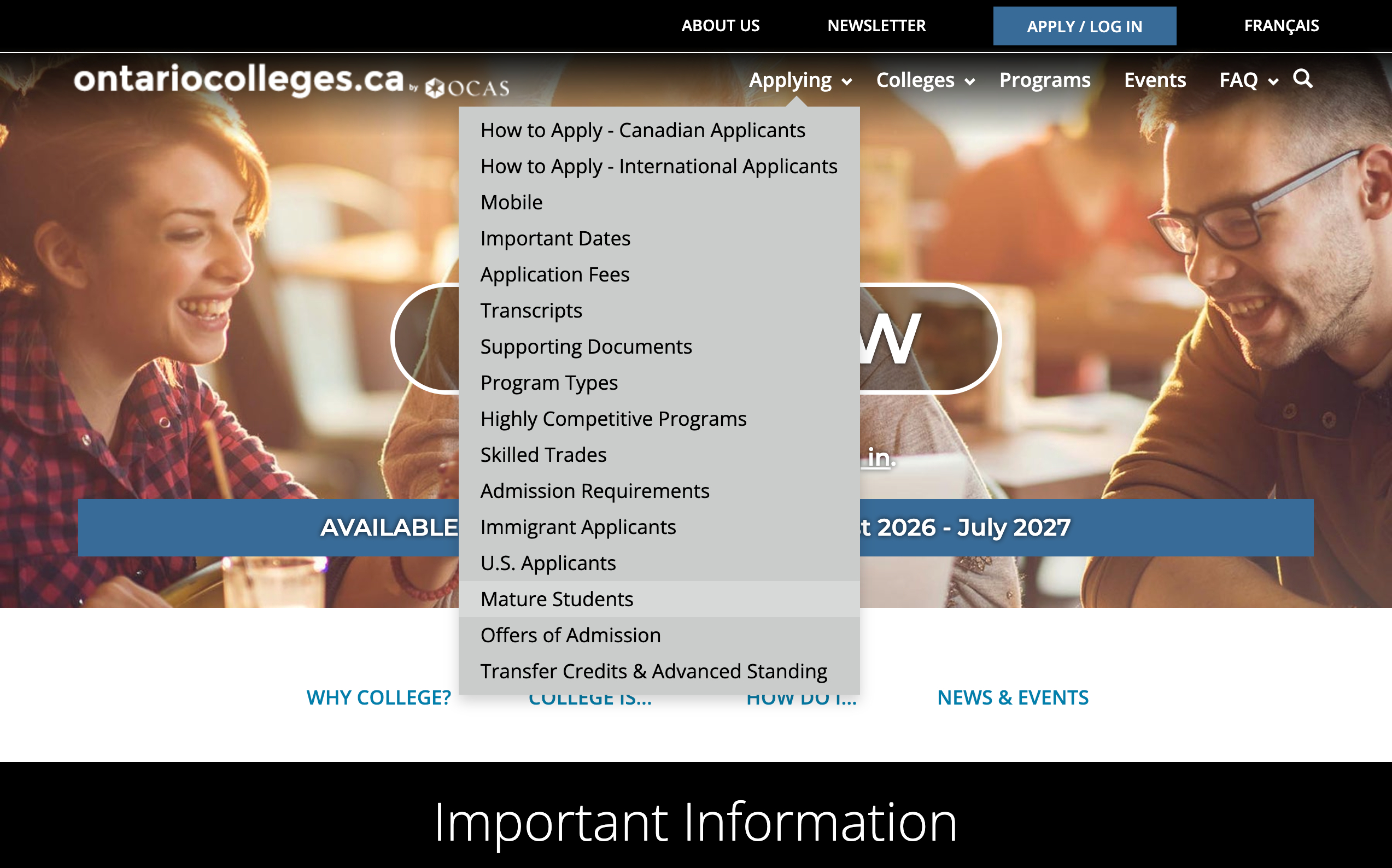
Legacy Navigation - Fragmented and Overly Complex
2 / After
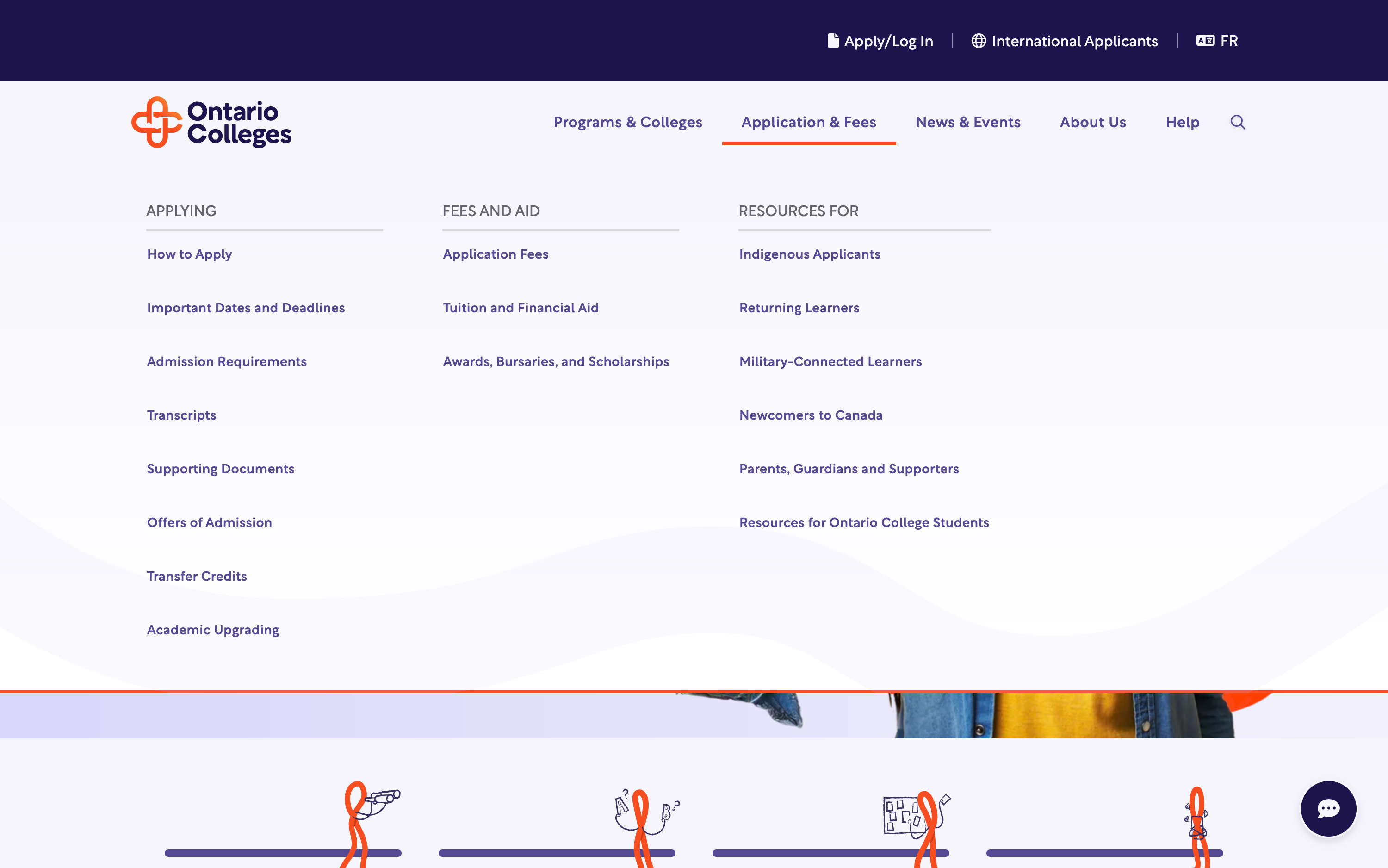
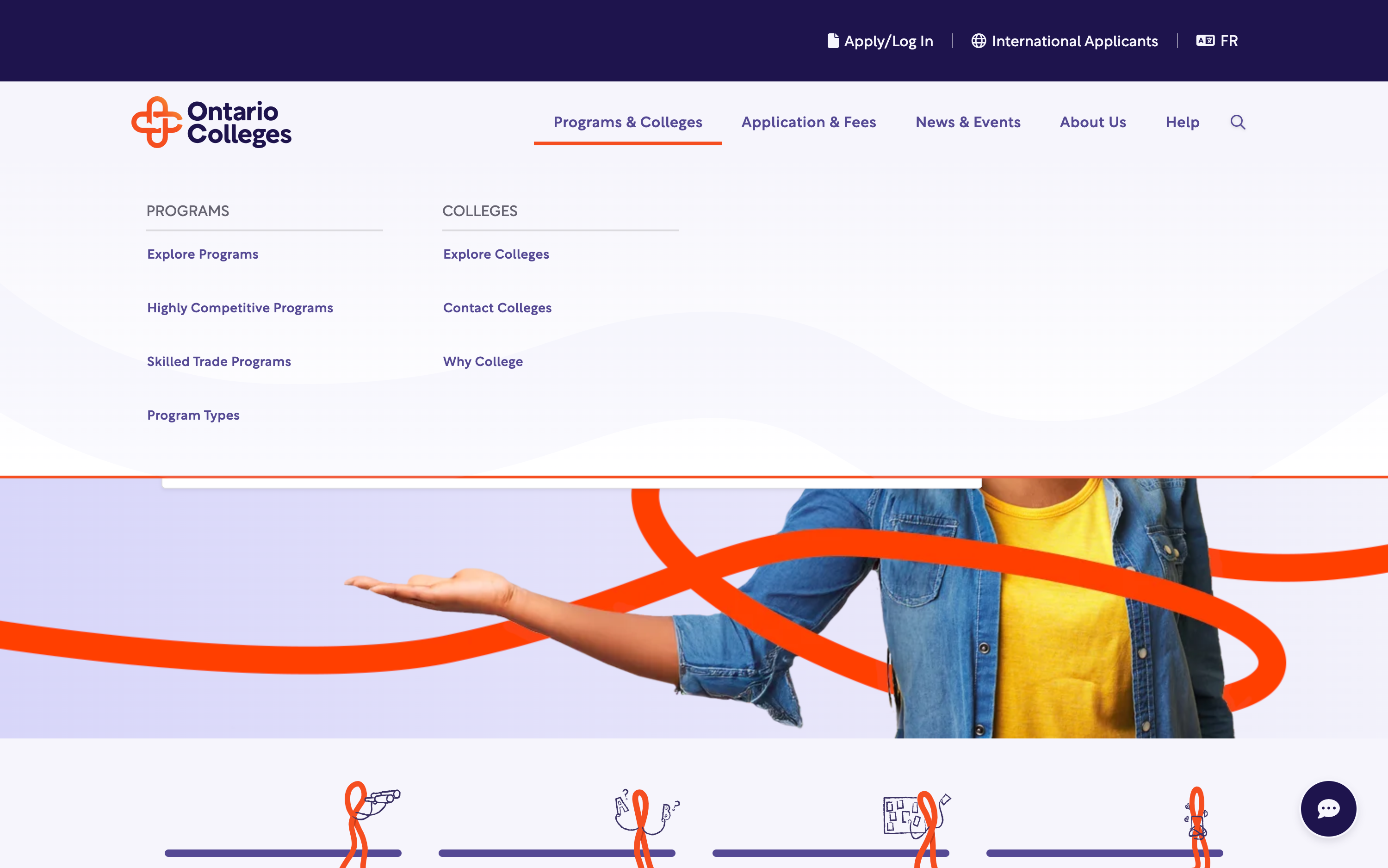
Dedicated entry point for international applicants
Simplified top-level navigation
Clearer category hierarchy
Reduced redundancy and duplication
Accommodated new pages from evolving content strategy
Persistent visibility of Apply across pages
Labels aligned with user mental models
Shallow navigation paths with fewer steps
I redesigned the navigation model using a goal-based structure and implemented a mega menu to improve discoverability, clarity, and exploration efficiency offering a broad yet clearly organized view of all major content areas — reducing the number of clicks and allowing users to orient themselves instantly.
3 / Redesigned Information Architecture and User Flows
Final Designs
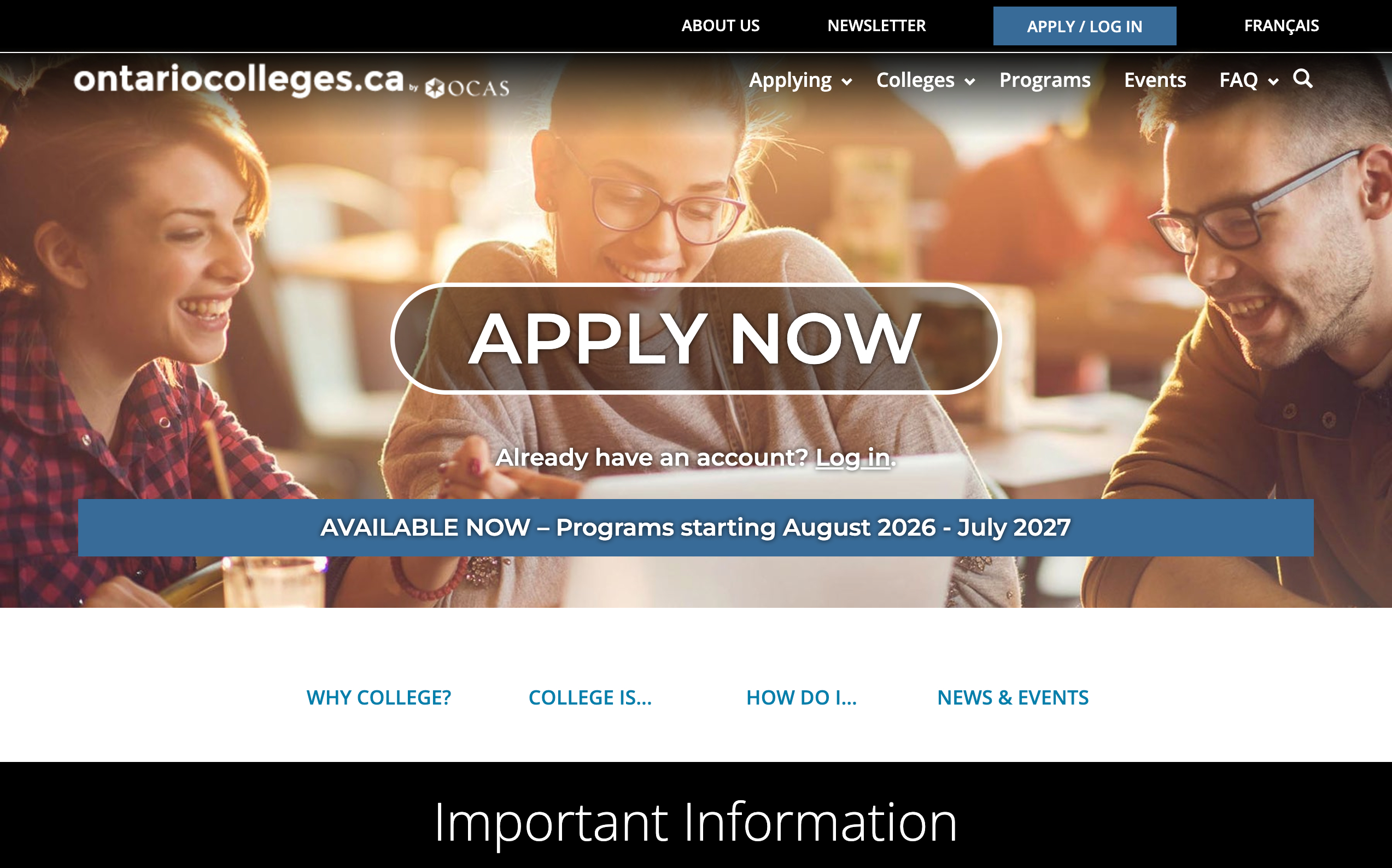
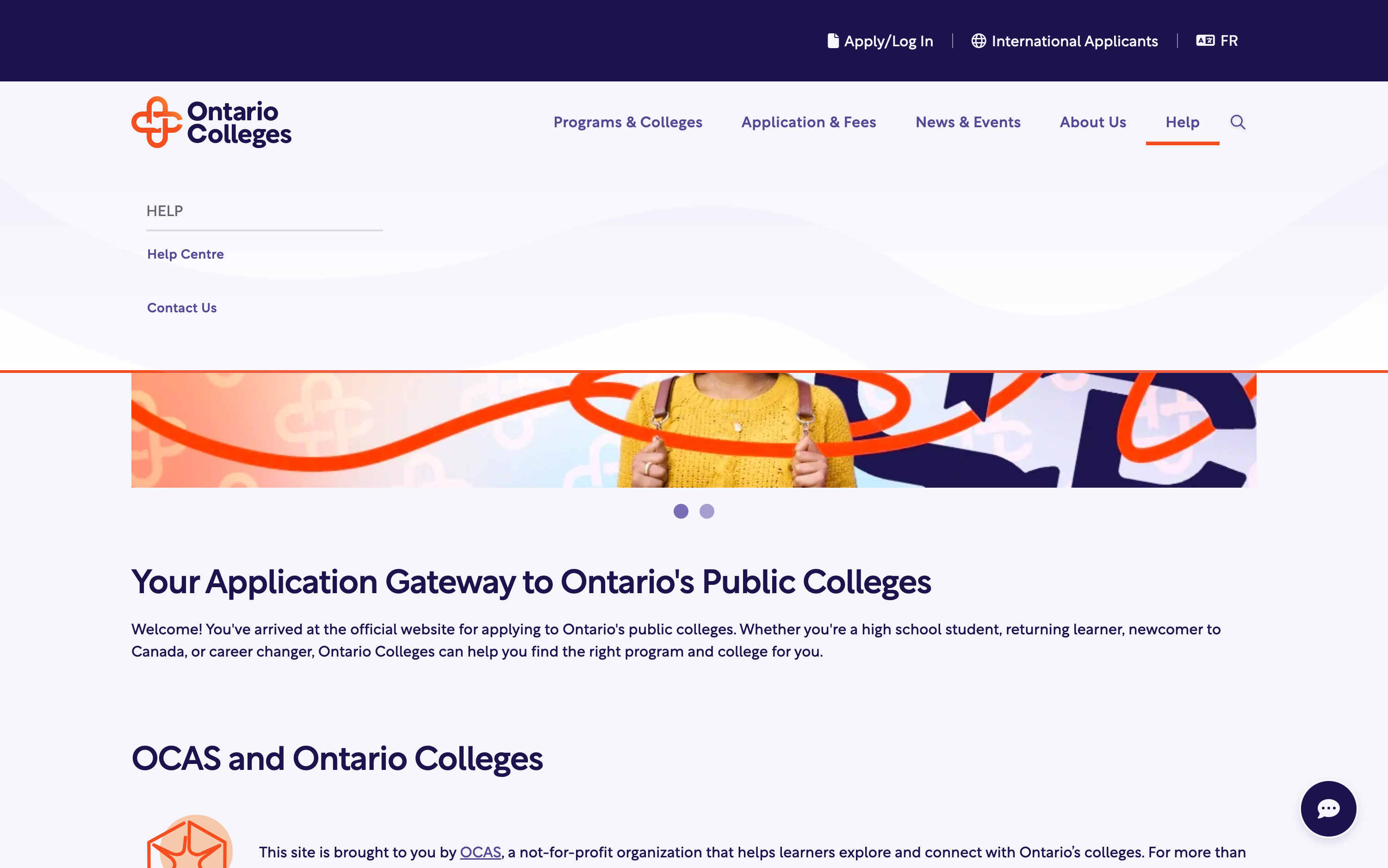
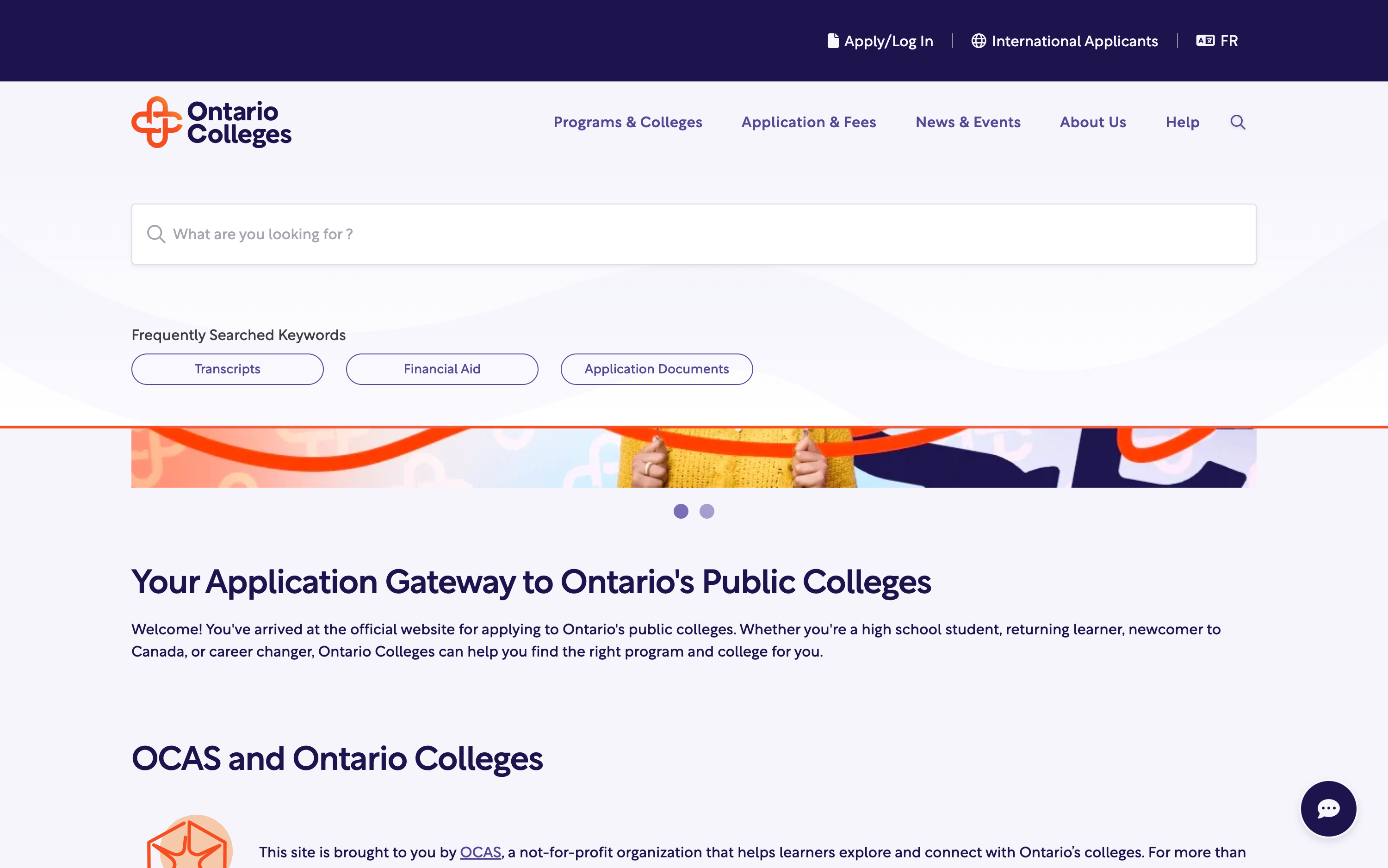
1 / Homepage as “decision accelerator”
Explore → Choose → Plan → Apply journey framework
Dedicated space for time‑sensitive updates
Search as the primary entry point
High‑level guidance for undecided users
Action‑Driven Guidance provides reassurance and orientation without deep cognitive load
Dynamic modules (Events, News, Featured content)
Newsletter Signup to support retention after exploration
2 / Program Exploration
Programs hub optimized for exploration behavior
Reduces cognitive load by helping users quickly find relevant programs in a large dataset.
Filters and search aligned to users’ ability to find and compare programs
Users who are unsure what program they want can explore programs by field of interest
Each main category expands into relevant subcategories, helping users narrow down their focus step by step.
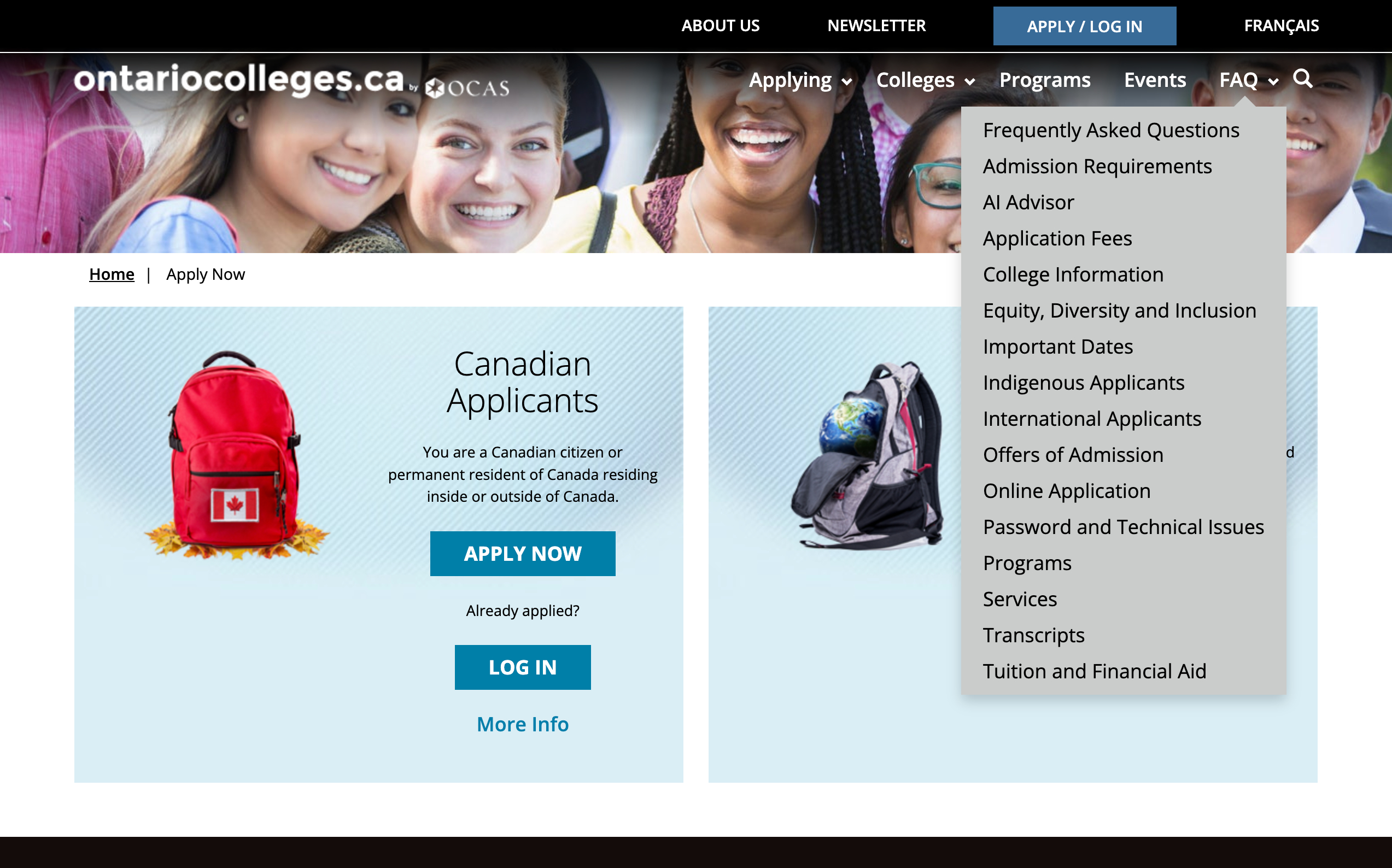
AI Advisor to meet users where they are in their decision-making journey — whether they’re just beginning to explore or looking for structured, informative next steps.
Featured Programs
Anchor tags on the left-hand side allow for seamless switching between categories, creating a smooth and intuitive browsing experience.
Within each category, users can search by keyword, blending freeform discovery with targeted filtering.
Once a category is selected, users are taken to a dedicated description page
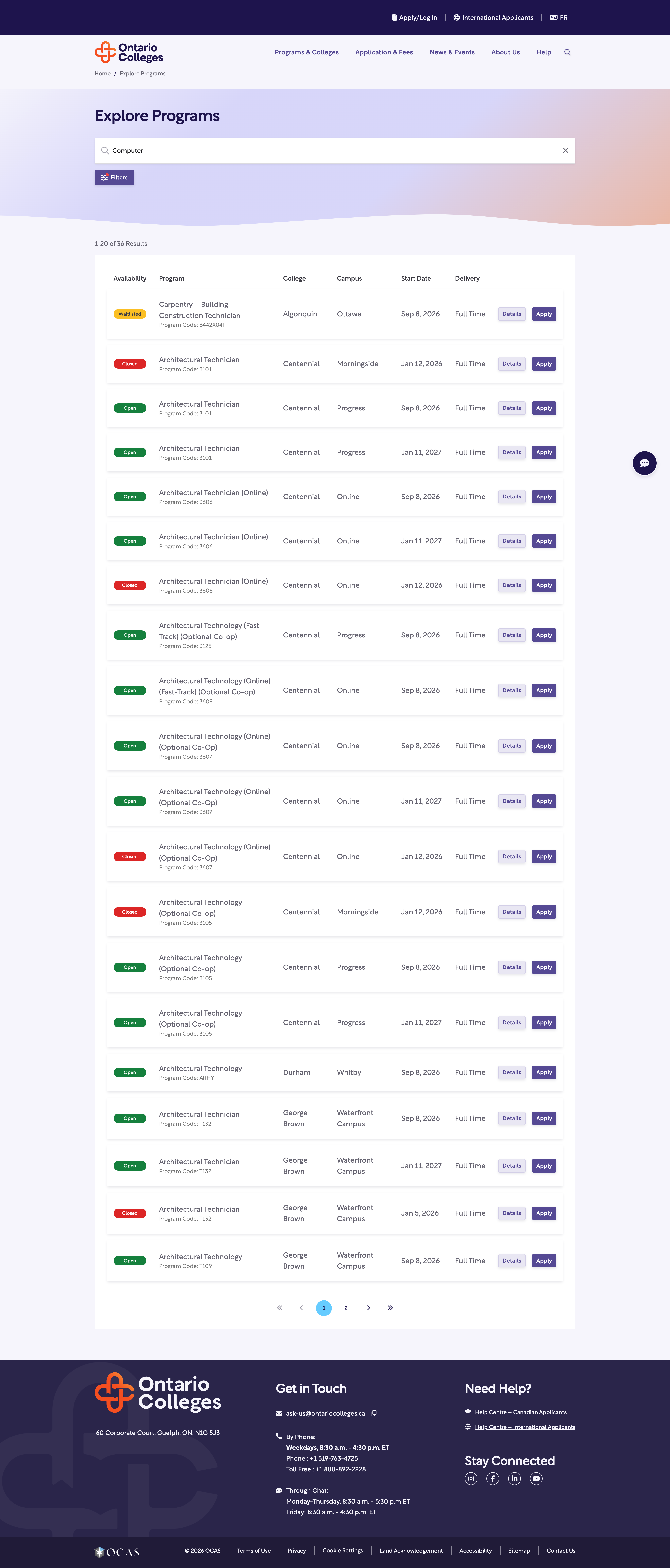
Restructured listings to improve scanability and comparison of key details such as availability, campus, delivery format, and competitive status
Expanded search beyond program titles to include keywords and filters, allowing users to quickly find relevant programs.
Elevated “Apply ” to support faster decision-making.
Cards prioritize scanability and comparison.
Improves decision efficiency, allowing users to evaluate many options quickly.
Design ensures the platform remains usable even as the program catalog grows.
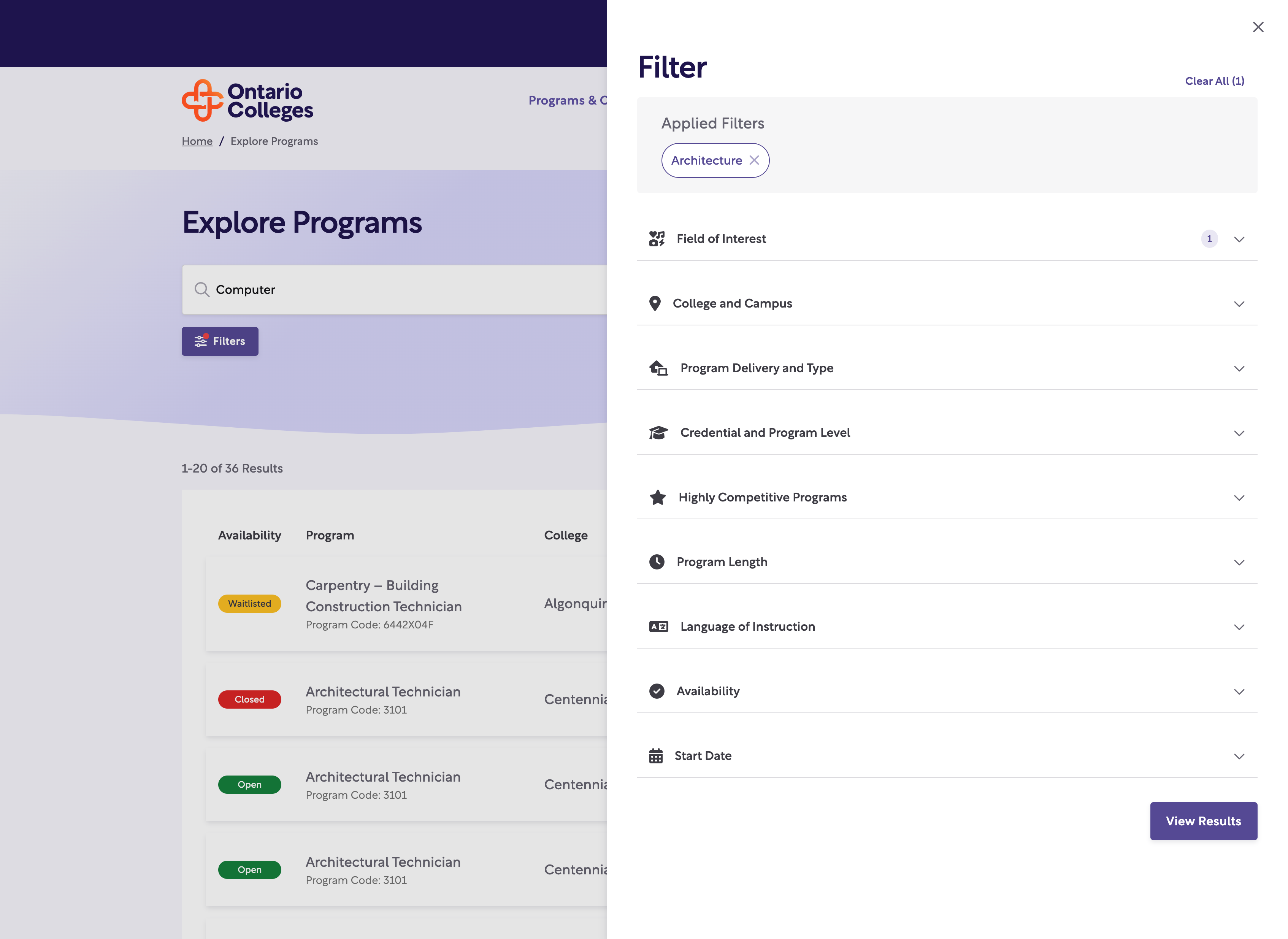
Filters are used to progressively narrow the search space instead of overwhelming users with too many categories upfront.
Simplified filter labels and interactions to match user mental models.
3 / Program Detail Page
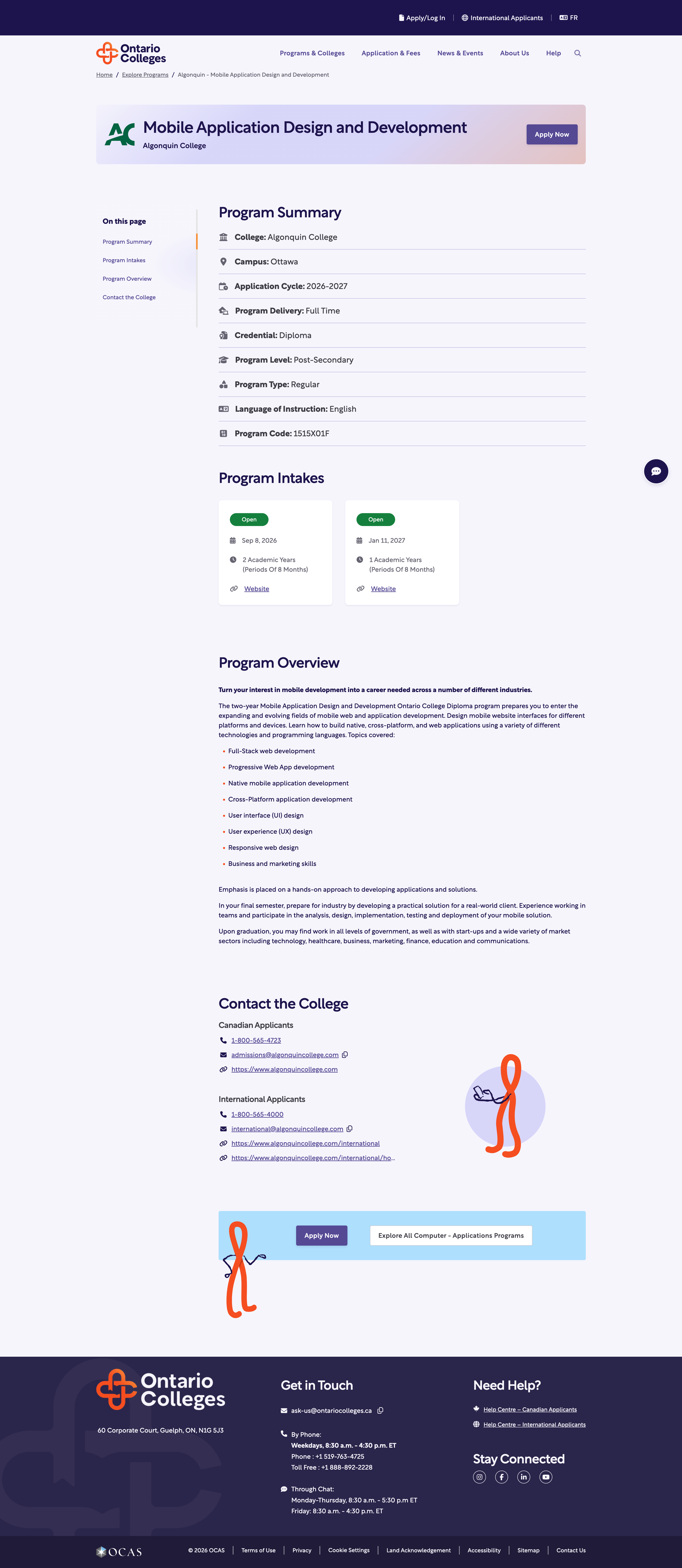
Replaced modals with full program pages to improve readability, support sharing, clearly communicate intake and eligibility details, and increase user confidence.
Placed “Apply Now” at key decision points and provided clear paths to continue exploring, preventing dead ends.
Helps users determine whether a program is a good fit before starting the application process.
Hierarchy + progressive disclosure for decision-critical content
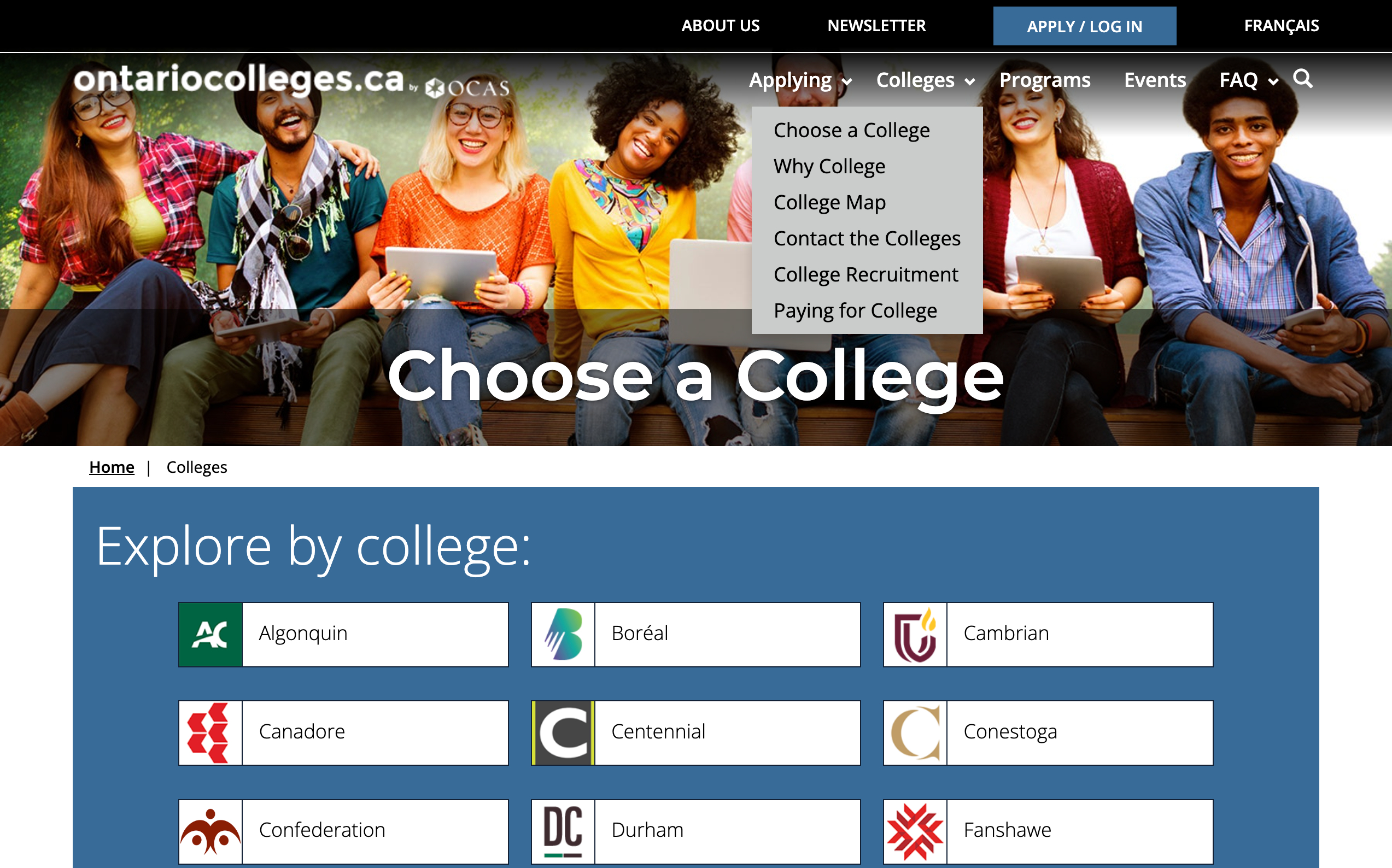
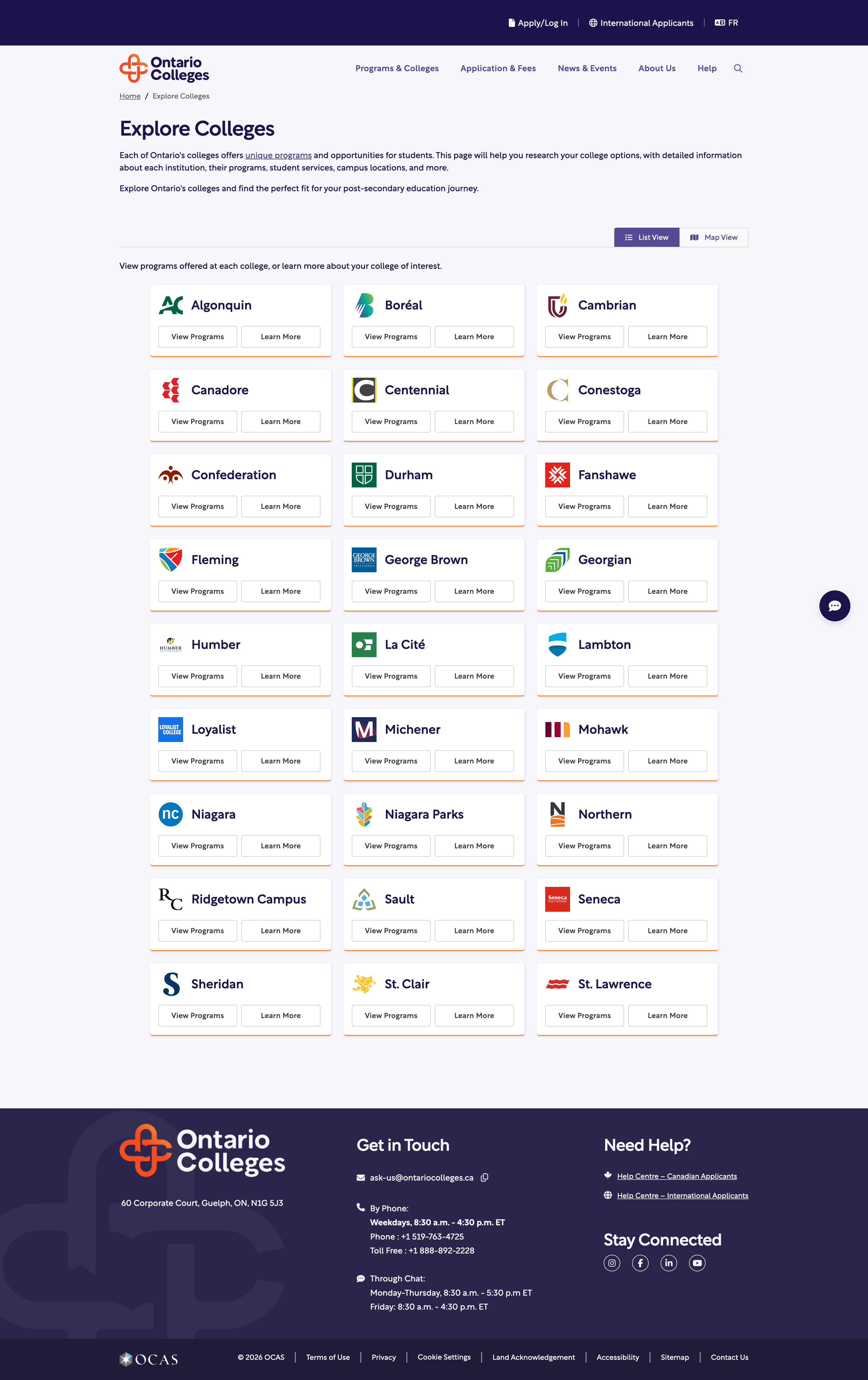
4 / Exploring Colleges
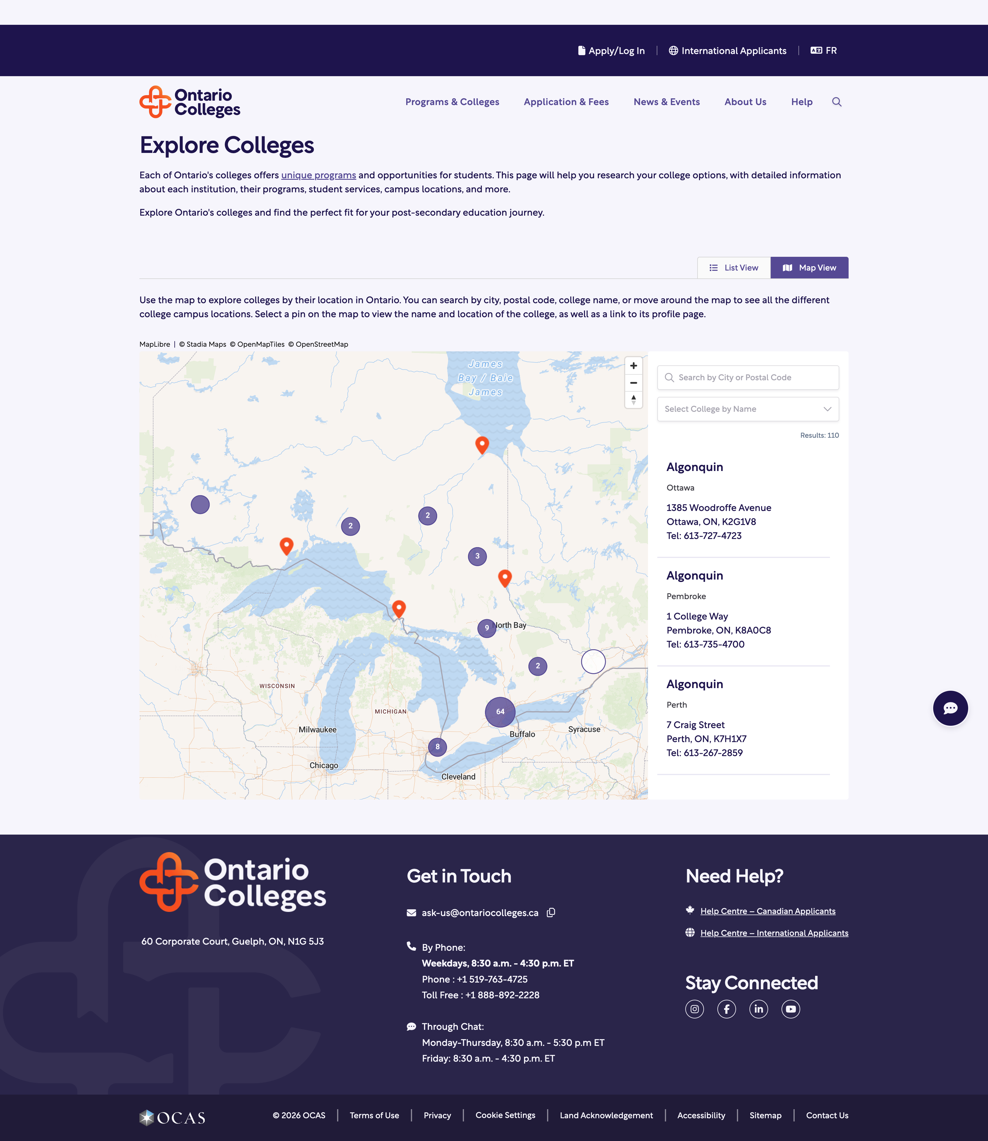
Support multiple exploration behaviors: Users who want to browse colleges geographically and
Users who want to scan all colleges alphabetically.
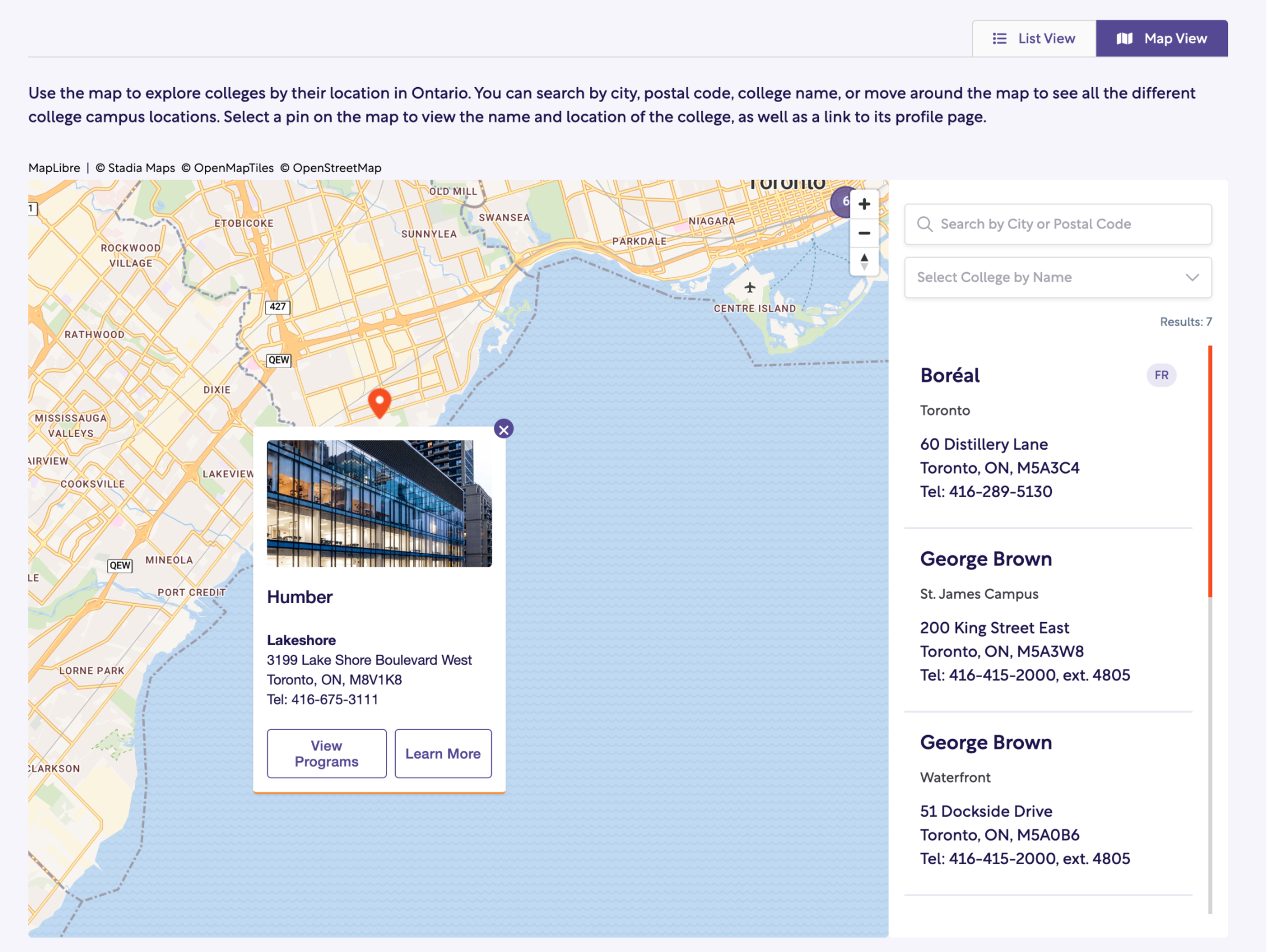
Each college card or map pin links to a dedicated college profile page.
Provided a structured list view with alphabetical filtering, campus summaries, and quick access to College Profile pages, supporting users who prefer browsing over map interaction.
4 / College Profile Page
Introduced scalable, CMS-driven profiles featuring hero image galleries, quick statistics, campus maps, featured programs, and partner links — improving clarity, shareability, and flexibility while supporting partner storytelling and search visibility.

College profiles function as decision-confidence surfaces.
Improves confidence when choosing between multiple institutions.
The hard moment (and how I handled it)
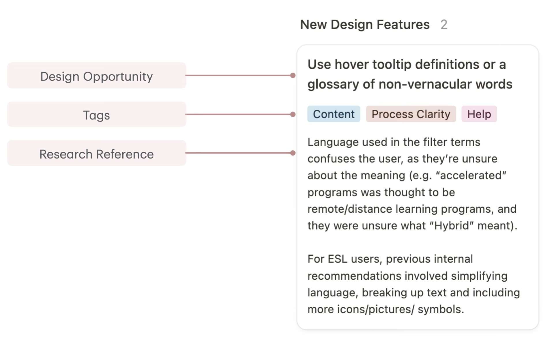
Challenge: Balancing “more clarity” with the reality that applicants still need comprehensive information—especially across many content-heavy pages. Internal notes explicitly flagged that dense text caused users not to scroll and miss key information.
What I did: I pushed for a structure-first solution (hierarchy, summaries, anchors/progressive disclosure) rather than trying to “simplify” by removing content—so we improved usability without losing completeness.
Outcomes and Impact
1 / Quantitative Outcomes
27.0% → 37.8% (+40% lift)
Overall conversion
(Visitor → Apply)
10.5% → 19.6% (+86.7% lift)
Programs funnel
(Programs → Apply)
37% → 32%
(-13.5% drop)
Bounce rate
63% → 68%(+7.9% lift)
Engagement rate
2 / Qualitative Improvements
Higher task success
Faster completion times
Reduced confusion around requirements
Clearer navigation
3 / Behavioural Signals
Increased program detail engagement
Higher filter usage
Reduced early drop-offs
Increased
listing -> detail click-through
Together, these shifts point to a platform that better supports high-stakes decision-making — helping users find relevant options faster, understand them more clearly, and move forward with confidence.
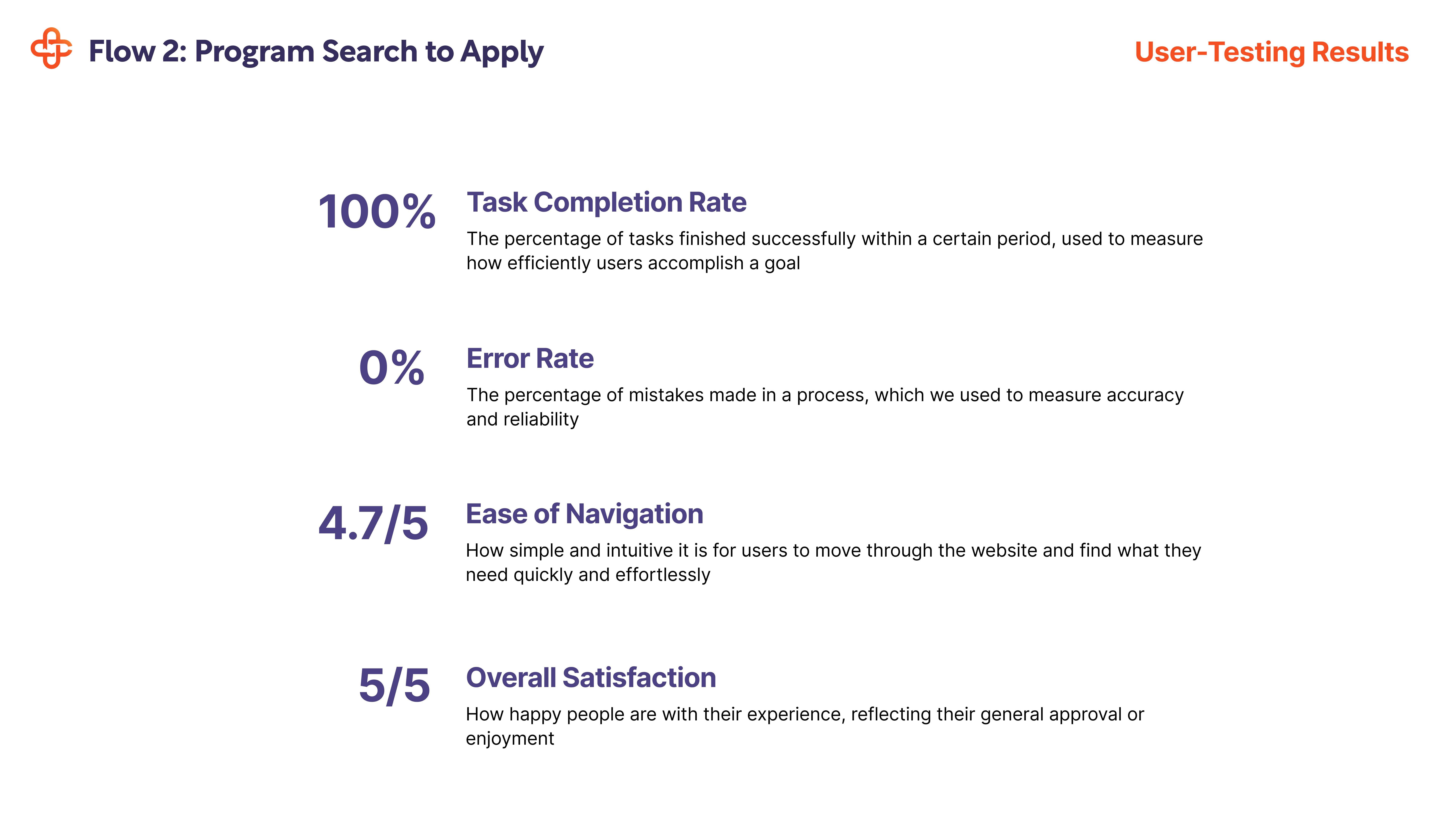
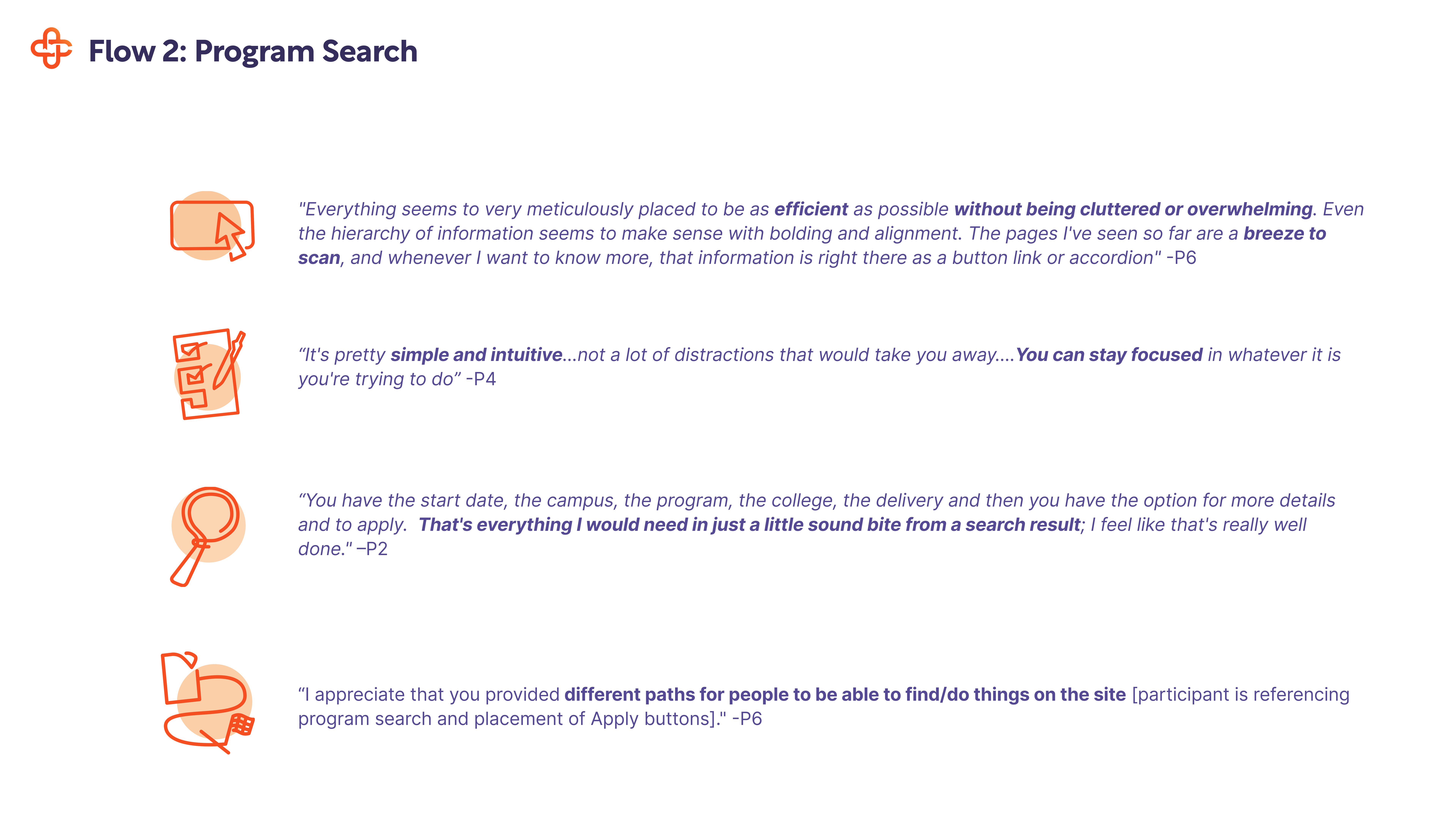
Validation: User Feedback and Usability Testing Results
Reflection
This project reinforced that impactful design at scale is rarely about flashy moments — it’s about making consistent, research‑backed decisions that help people move forward with confidence. Even in highly complex, constraint‑heavy environments, there is always something to learn. This work deepened both my product judgment and my collaboration skills in ways that continue to shape how I approach large platforms.
Key Takeaways
1. Decision‑making is the real UX problem
Users didn’t need more information — they needed help *narrowing options*. Designing for confidence, not completeness, had the biggest impact on outcomes.
2. Mental models beat internal structures
Re‑aligning navigation, filters, and labels to how users think (not how organizations are structured) unlocked major gains in usability and conversion.
3. Scalability is a design responsibility
Designing systems that content and partner teams could extend independently was just as important as the UI itself.
4. Progress over perfection wins at scale
Shipping in phases, validating early, and iterating with real data allowed us to deliver meaningful improvements without risking a high‑traffic platform.
5. Leadership shows up in trade‑offs
As one of two designers, the work required constant prioritization — knowing when to push, when to simplify, and when to align cross‑functionally.
What I’d Do Differently
-
Introduce lightweight user validation even earlier in the homepage phase to test messaging hierarchy before visual design
-
Formalize a shared decision log earlier to reduce downstream alignment friction across large stakeholder groups
